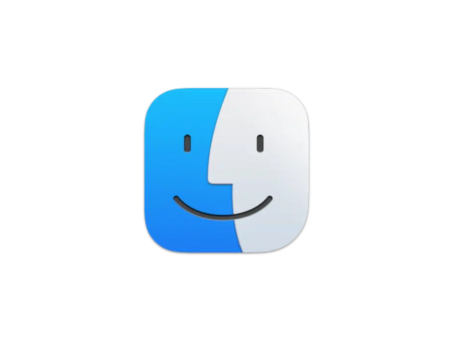
Apple has restored the classic Finder icon design in macOS Tahoe Beta 2, responding to backlash over a bold visual change introduced in the first beta.
Finder Redesign Faced Swift Criticism
In macOS Tahoe 26’s initial beta, Apple flipped the Finder icon’s color layout. The darker shade, traditionally on the left, appeared on the right—breaking a design standard that lasted nearly 30 years.
Many longtime Apple users voiced concern. Stephen Hackett, a well-known Apple historian and podcaster, publicly criticized the update. He explained that the original layout held symbolic value and consistency throughout decades of macOS versions.
Hackett’s commentary gained traction online. Tech communities across social media, blogs, and podcasts echoed his concerns.
Apple Acts Quickly and Listens to Feedback
Apple moved fast. In Beta 2, the company brought back the darker blue on the left side of the Finder icon. While keeping the updated Liquid Glass effect, Apple returned to its traditional layout—honoring past design choices while staying modern.
During a WWDC interview, Apple’s Software Engineering Chief Craig Federighi acknowledged the public feedback. Although the moment wasn’t part of the official transcript, podcast hosts later confirmed that Federighi had heard and appreciated Hackett’s input.
Why This Change Matters
The Finder icon isn’t just a symbol—it’s a piece of Apple’s design identity. First introduced in System 7.5.3 and later adapted in Mac OS X, the icon has become instantly recognizable to Mac users worldwide.
By restoring the familiar color scheme, Apple showed it values community input. Instead of defending the new look, the company made a thoughtful correction.

