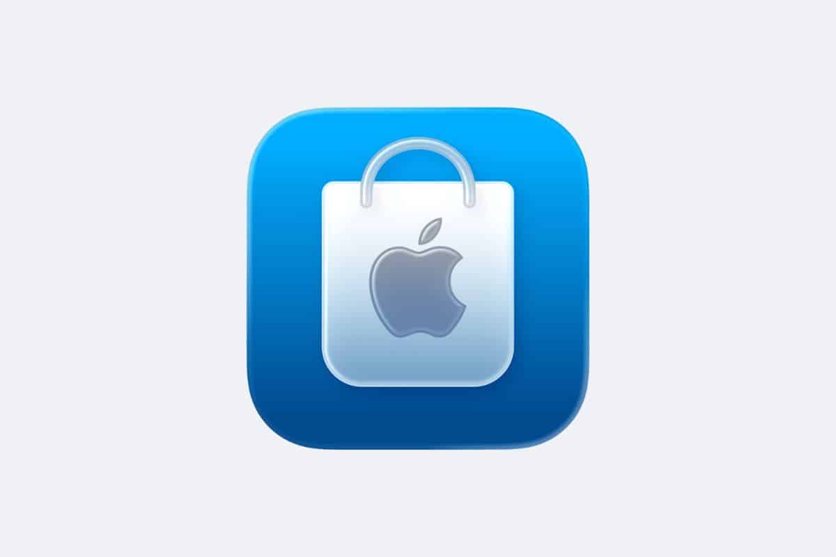
Apple has rolled out a major visual update to its Apple Store app, bringing the new Liquid Glass design language to one of its most widely used iOS applications. The redesign arrived shortly after the release of iOS 26.2 beta 2, marking another step in Apple’s slow but steady transition away from its long-standing flat design.
The updated app now features a reversed color scheme on its icon. Instead of the classic white background, the icon displays a bold blue background with a white Apple shopping bag at the center. This change aligns the app with Apple’s newer design standards and gives it a more modern presence on the Home Screen.
A More Modern and Unified Interface
Inside the app, Apple introduced a Liquid Glass tab bar that replaces the older button layout. The main sections—For You, Products, Go Further, and Bag—still remain, but their appearance now matches the aesthetic Apple previewed at WWDC. Because of this, the interface looks more consistent with the rest of iOS 26’s system-wide visuals.
Apple also included performance improvements and general refinements in version 6.6 of the app. Although the company did not detail every change, these updates typically enhance loading times, animations, and reliability.
Part of a Larger Refresh Across Apple Apps
This redesign follows a growing list of Apple apps moving to Liquid Glass styling. Apple recently refreshed the Apple TV app icon and even used real glass to craft elements of its new branding. GarageBand also received a Liquid Glass icon, though Apple’s iWork suite has not yet transitioned.
The rollout reflects a major shift from the flat design introduced with iOS 7 more than a decade ago. As Apple continues updating its first-party apps, developers are expected to follow, though the company acknowledges it may take time for the broader ecosystem to adopt the new look.


