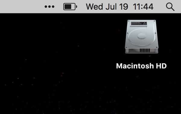
Apple’s latest macOS 26 developer beta, codenamed Tahoe, introduces a small yet symbolic design shift. The iconic Macintosh HD drive icon—long a visual staple for Mac users—is being retired. In its place, Apple is introducing a sleek, SSD-inspired design that reflects the tech hardware in current use.
Farewell to the Classic Drive Icon
For years, the Mac HD icon represented a traditional hard drive, complete with metallic casing, screws, vents, and even a tiny warning label. Although Apple stopped using spinning hard drives in its Macs over a decade ago, the icon remained. Its nostalgic look reminded users of earlier Mac models and the roots of personal computing.

A Design That Matches the Times
The new SSD icon, first spotted by 9to5Mac, features smooth, rounded corners and a bold Apple logo on the front. Its design better matches Apple’s modern aesthetic and aligns with the hardware found in all current Mac models. The update is part of a broader move to make macOS visuals more consistent and current.
User Reactions Remain to Be Seen
While the shift is minor from a functionality perspective, visual updates in macOS often spark strong opinions. For example, a Finder icon redesign years ago caused notable backlash. Apple appears to be taking a more subtle approach this time, possibly avoiding the same reaction.
A Nod to the Future
This update signals Apple’s ongoing push toward simplification and modernization. Though the old icon carried sentimental value for long-time users, the new design aligns with the company’s future-facing vision.


