Recent Updates on iMac
iMac
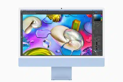
At TUAW, our dedicated iMac section provides the latest insights, updates, and user guides on this iconic Apple product.
At TUAW, our dedicated iMac section provides the latest insights, updates, and user guides on this iconic Apple product.